The purpose of this article is to explore and understand dark patterns, from their functioning to strategies to avoid them, providing a comprehensive guide for a more transparent and ethical digital experience.
😈 What Are Dark Patterns?
Dark patterns are UX persuasion techniques used on websites or apps with the aim of manipulating user decisions to perform specific actions against their will. These patterns prioritize the company's goals over the needs and expectations of users.
These patterns are not only used in the digital world but can also appear in real life, such as deceptive marketing practices.
The term "dark patterns" was coined by Harry Brignull in 2010 when he noticed this manipulation on many websites. From there, he created a list of these patterns to help people recognize and protect themselves from them.
🛠️ How Do Dark Patterns Work?
In the UX (User Experience) world, all professionals know that most people do not read all the text on a web page; rather, they tend to scan the content diagonally.
When users navigate the internet, they rely on visual cues to navigate through the interface. This behavior is not reprehensible on the part of the user, as it assumes that the company that developed the product or service has no ill intentions.
Unfortunately, this dynamic of interaction with the user interface provides malicious actors with a variety of opportunities to deceive and take advantage of their users.
Example:
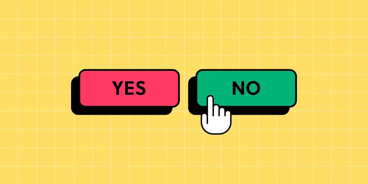
People associate green with "accept" and red with "cancel." By changing these associations, we can deceive the user. For example, if we use green for "cancel" and red for "accept," we can confuse the user and lead them to make wrong decisions.
🔍 Types of Dark Patterns
There are many types of patterns. Among the most popular are the following:
- Trick questions: These are questions that confuse or deceive users. For example, a website may ask users to accept terms and conditions, hiding an unwanted subscription agreement within that acceptance.
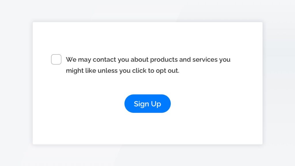
- Sneak into Basket: Products or services added to users' shopping carts without their consent, often through pre-checked boxes or unclear opt-out options during the checkout process.
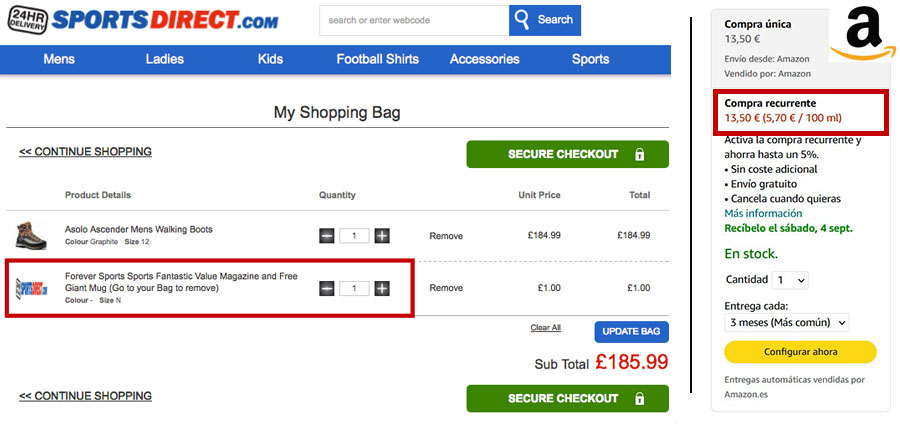
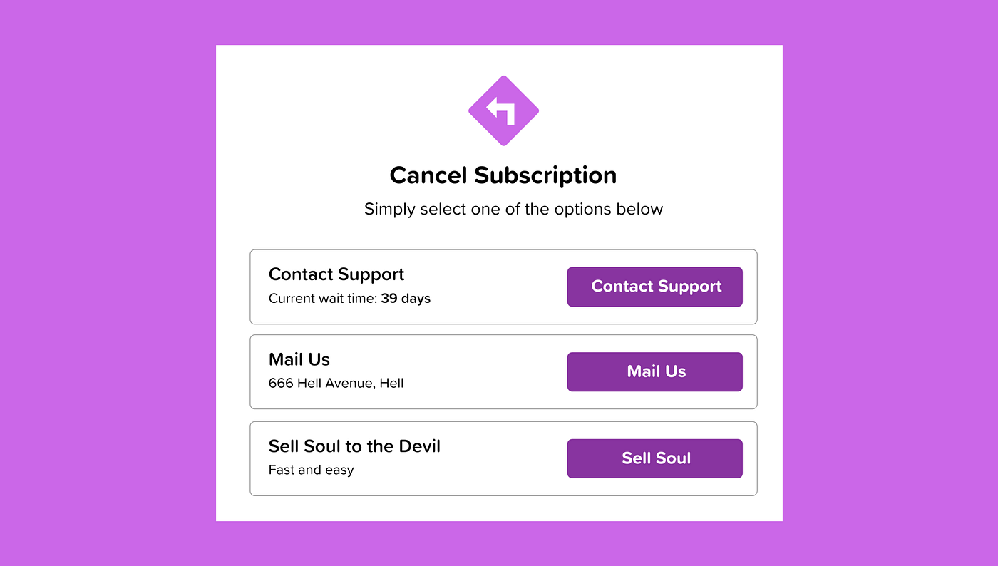
- Forced continuity / Roach Motel: It's easy to get in but hard to get out. For example, a subscription service may make it easy to subscribe but require a long and complicated process to cancel the subscription.
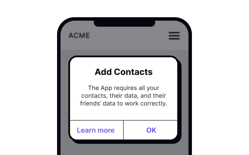
- Privacy Zuckering: Users are made to disclose more information than planned, often through confusing privacy settings or misleading indications. For example, Meta's default privacy settings often lead users to share more than they intended.
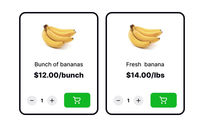
- Price Comparison Prevention: Retailers manipulate or hide prices to prevent users from easily comparing them with competitors' prices, often by adding hidden fees or charges during the checkout process. A well-known example is Sainsbury's supermarket in the UK, where they do not allow comparing unit prices with kilogram prices of fruits.
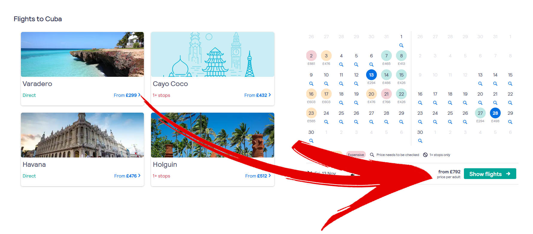
- Bait and switch: Users are lured in with a promising offer, only to find out it is not available or is of inferior quality, and they are encouraged to buy a more expensive alternative.
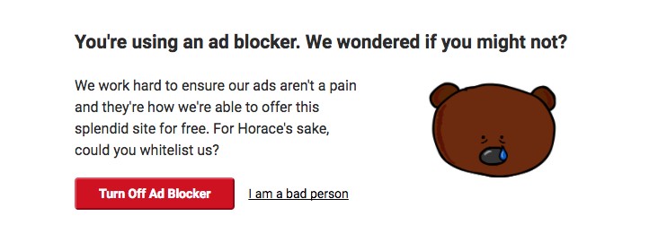
- Confirmshaming: Confirmshaming is when a website implies that rejecting an offer is morally or socially unacceptable. For example, instead of a simple 'No, thanks' to unsubscribe from a newsletter, it might say 'No, I prefer to pay more.' This attempts to make users feel that rejecting the offer is a negative or unreasonable decision, manipulating them into accepting it.
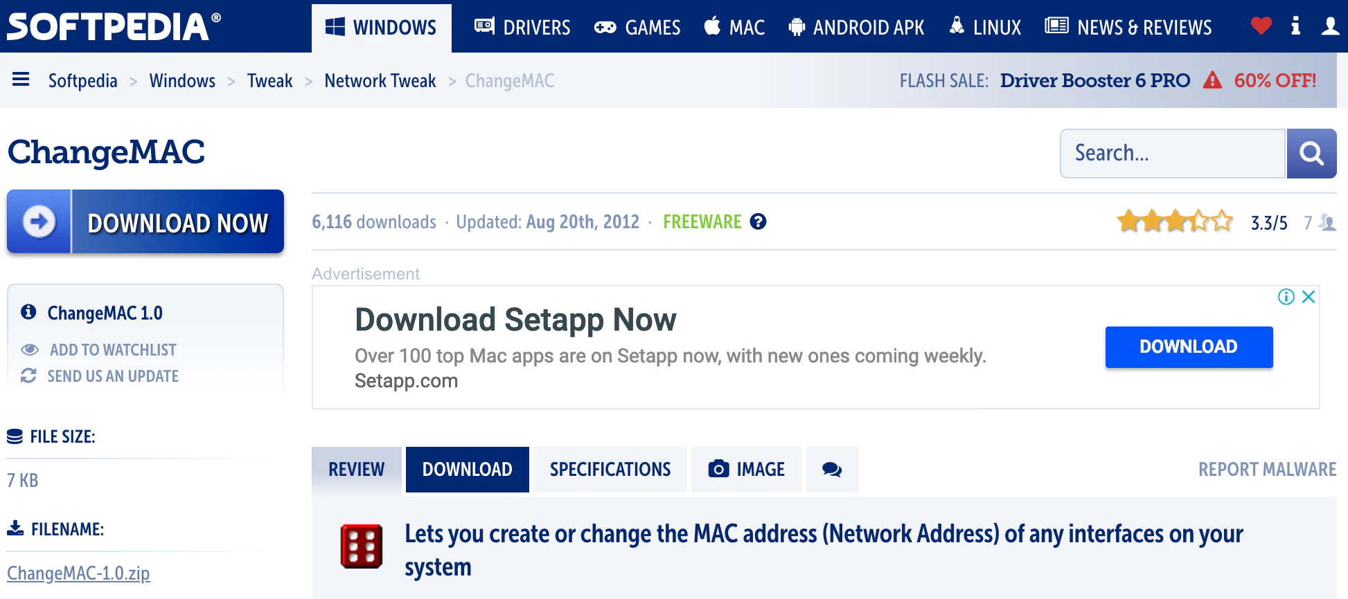
- Disguised Ads: Ads are disguised as regular content, making it difficult for users to distinguish between genuine content and paid promotions. An example would be an ad presented as a download button to induce users to click on it. Sometimes, this ad may look like a genuine download button, but it actually redirects the user to an advertising page.
- Misdirection: Users are intentionally guided toward a specific action or outcome through misleading or confusing design elements, often to benefit the platform at the expense of the user's experience or understanding. An example would be airlines on online flight bookings: in one section, they ask you to choose your seat, often with an additional cost. Although this option is an optional extra, it is presented as a necessary action, making users focus on completing it, while the part indicating it is optional is out of focus.

- Hidden costs: Additional expenses or charges are not clearly revealed, creating the perception that a product or service is more affordable than it actually is until the checkout stage. For example, on Airbnb, the initial price per night hides cleaning fees, service fees, and other taxes, significantly increasing the final price without users anticipating it.

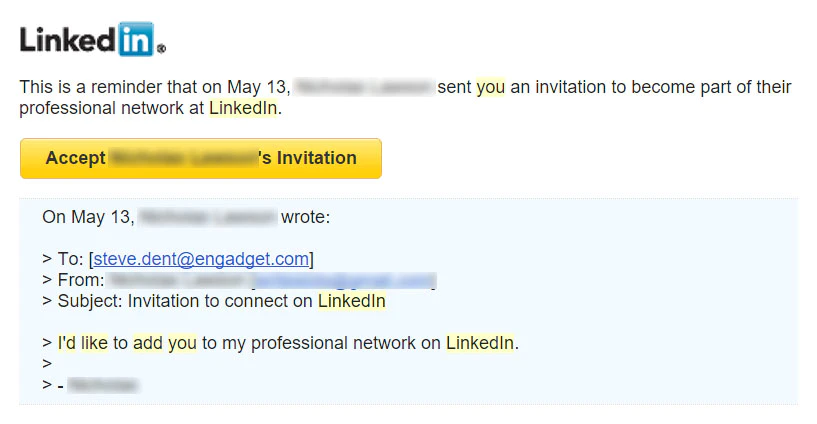
- Friend Spam: Users' friends receive many unwanted invitations or messages from a platform, often without the user explicitly authorizing them. This is done to increase user interest or participation or to expand the platform's user base. A well-known example is LinkedIn, which was sued in 2015 for $13 million in California. Victims of this pattern between September 2011 and October 2014 could claim $10.
- Road Block: Users encounter unnecessary obstacles or barriers that prevent them from completing a desired action, such as excessive forms or mandatory registrations. For example, a news website asks for registration before reading the news.

🚀 Why Do Companies Use Them?
Many companies have faced criticism for using dark patterns, and some governments have begun to regulate their use. However, there are still companies that use these techniques for the following reasons:
-
Increase sales: Manipulate users to make purchases or actions they would not otherwise make.
-
Obtain more user information: Obtain more information than users would be willing to provide.
-
Get user consent: Obtain user consent for certain terms and conditions, such as data privacy.
-
Increase usage time: Force users to spend more time on an application or website.
-
Increase participation in social networks: Convince users to share information on social networks or to participate more actively.
However, the use of dark patterns can lead to legal consequences and damage to the company's reputation. A notable example is the case of the online travel company Booking.com in the European Union, which was investigated for deceptive practices in presenting its offers.
🛡️ How Can We Avoid Dark Patterns?
Professionals:
UX designers and developers should advocate for respectful treatment of customers by offering options that are transparent and clear. Although this will not bring in the same short-term gains as a dark pattern, it will lead to a less frustrating and better customer (UX) experience.
Users:
For users, we attach a few actions that will help minimize the impact of dark patterns:
-
Learn to recognize dark patterns: It is important to be alert and recognize when we are being manipulated with a dark pattern.
-
Read terms and conditions carefully: Often, dark patterns hide in small print or in terms and conditions documents. It is important to read these documents carefully and pay special attention to anything that seems suspicious or misleading.
-
Use ad-blocking and privacy tools: Some ad-blocking and privacy tools can help protect against dark patterns presented in online advertising.
💭 Conclusions
We hope this information serves as a useful guide to protect against deceptive online practices and promote a more honest and clear digital experience.
Developers, it is essential to keep in mind that the decisions we make in our day-to-day directly affect how users perceive our company or brand. For these reasons, we must commit to working with integrity and ethics every day. Together, let's create a digital environment where everyone feels comfortable and safe!


